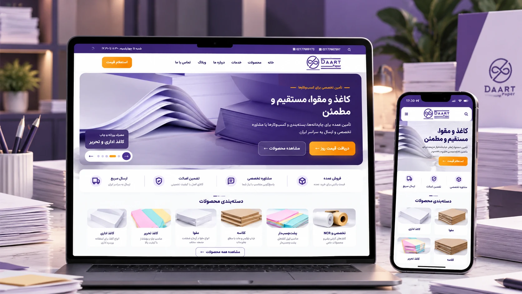

Designing and developing a B2B website for product discovery, specialist content, and turning visitors into pricing inquiries
Starting Point: When the Digital Experience Doesn’t Match the Business
Daart Paper is an established company in the paper and board market.
But its digital presence did not reflect the level of experience and credibility the business had built offline.
The issue was not only visual. The content structure, product discovery flow, and the way users were guided toward making an inquiry all needed to be reconsidered.
So instead of making a few surface-level improvements, the project became a full redesign — covering user experience, page structure, content, forms, and the SEO foundation.
The Goal: Turning the Website Into Part of the Sales Process
In the paper and board industry, purchases are rarely based on a fixed price and a standard checkout flow.
Paper type, GSM, dimensions, brand, availability, and order conditions can all affect the buying decision.
So the goal was not simply to build an online catalog.
The website needed to guide users from product discovery toward one clear action:
Requesting price and availability
That objective became one of the main principles behind the site structure and CTA system.
The Main Challenge: Many Products, but the Journey Had to Stay Simple

One of the key challenges was presenting a broad range of products without turning the site into a crowded and difficult-to-navigate catalog.
Before focusing on visual details, we worked on the information architecture and the user journey.
The structure was designed so users could quickly understand the main product categories, find what they were looking for, review the essential information, and move into the inquiry process when needed.
The priority was clarity over complexity.
Design: Professional, Clear, and Deliberately Uncluttered
The visual direction for Daart Paper needed to balance two things: the industrial nature of the business and the expectations of a modern professional website.
The interface could not feel too cold or overly technical, but it also could not look like a generic e-commerce store.
Color, imagery, spacing, and typography were shaped around three core ideas:
Clarity, trust, and easy access to information
The result was a cleaner and more contemporary interface without losing the practical nature of the business.
User Experience: One Clear CTA Instead of Multiple Competing Paths

One of the most important decisions was to simplify the call-to-action system.
Instead of presenting users with several different next steps across the site, the primary flow was centered around price and availability inquiry.
The inquiry form was designed to be straightforward, allowing users to submit a request without unnecessary friction and then move to a clear success state.
This made the journey from product discovery to lead generation much more predictable.
Content: Building an Educational Layer Around the Products
Daart Paper was not designed to be just a collection of product pages.
A specialist content layer was also developed as part of the project.
Articles were created around paper, board, printing, and product selection to support two goals:
Helping users make better purchasing decisions, and gradually expanding the site’s search visibility.
The content structure also included dedicated imagery, alt text, internal linking, and connections between articles and core pages.
SEO as Part of the Website Structure

SEO was not treated as a final step after design and development.
From the beginning, the project considered URL structure, page titles, meta descriptions, WebP images, image alt text, internal linking, and sitemap organization.
Redirects were also prepared for changed or legacy paths to reduce disruption during migration.
The aim was to launch with a technical foundation that could support long-term content growth rather than trying to retrofit SEO later.
From Development Environment to the Main Domain
The site was initially built and tested in a separate development environment.
Once the design, content, forms, and key flows were finalized, the project was migrated from new.daartpaper.com to the main daartpaper.com domain.
During the migration, redirects, links, the inquiry form, sitemap, indexing settings, and major pages were reviewed again.
The final structure was also kept flexible enough to support new products and articles without requiring another redesign.
The Result: A Foundation for Product Discovery, Trust, and Inquiries
The outcome was more than a visual redesign.
Daart Paper now has a structured digital presence that introduces its products clearly, supports specialist content, and guides users toward a defined conversion path.
The website moved from being a passive online presence to becoming part of the customer journey.
At the same time, its technical and content foundation was designed to support future growth.
What We Learned From This Project
In B2B projects, a more professional experience does not always mean a more complex one.
A large part of the work on Daart Paper was about reducing friction: making it easier for users to understand what is being offered, where to begin, and what to do next.
Once those three questions were clearly answered, design, content, and development could all align around the same purpose.
Project Snapshot
Client: Daart Paper
Industry: Paper & Board Distribution
Scope: Strategy, Information Architecture, UI/UX, WordPress Development, Content Structure, SEO Foundation
Platform: Web
Website: daartpaper.com