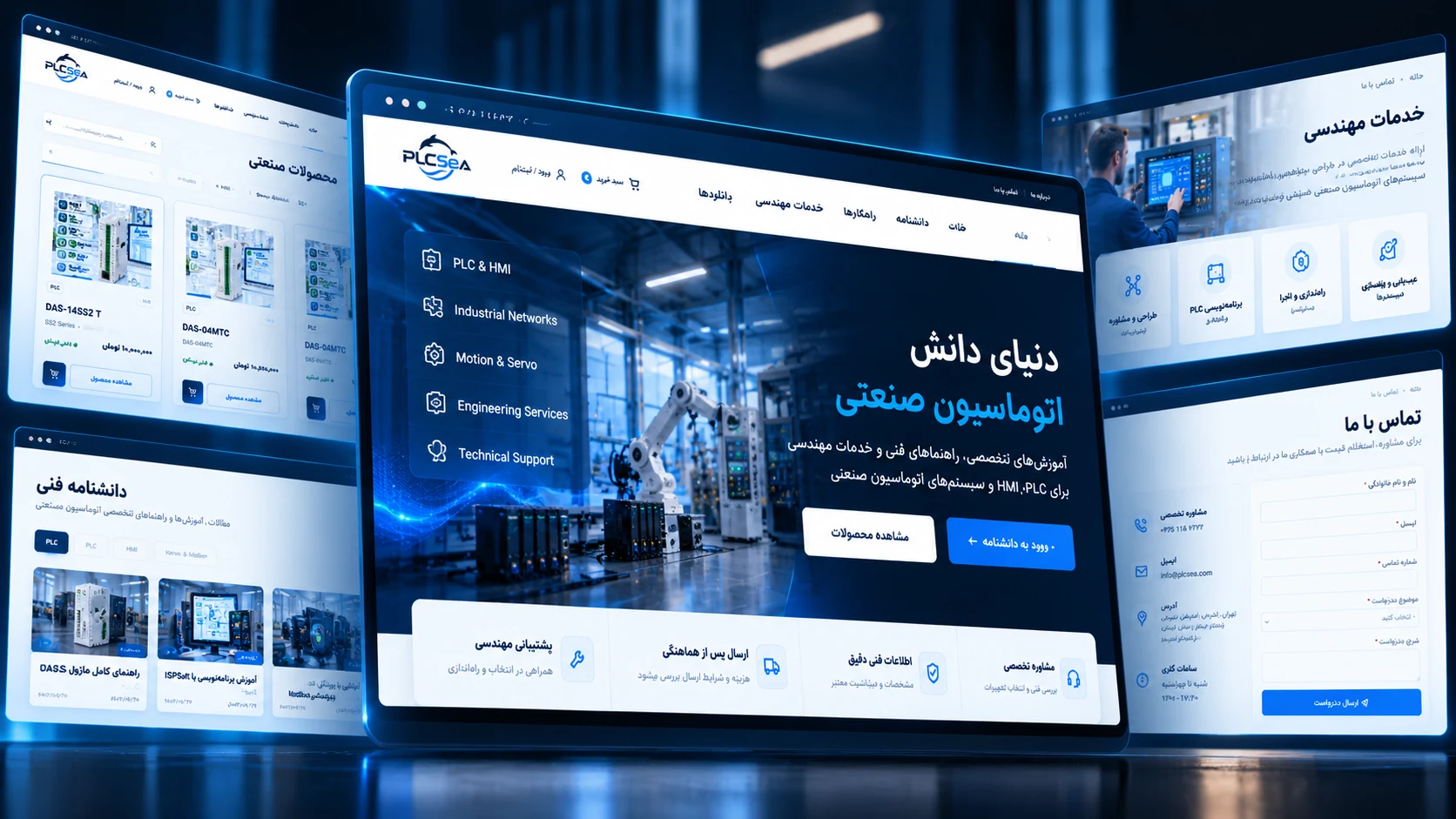

We often judge a website within the first few seconds of visiting it. Some websites immediately feel trustworthy, polished, and credible. Others fail to create the same impression, even when the business behind them offers strong products or services.
So what actually makes a website professional?
Is good visual design enough? Can modern colors, large imagery, smooth animations, and an attractive layout turn an average website into a professional one?
The short answer is: no.
A professional website is the result of several elements working together: design, user experience, content, technical performance, speed, SEO, and clear business goals. If one of these areas is ignored, even a beautiful website can feel incomplete.
Professionalism Is More Than Visual Design
Visual appearance is the first thing users notice, but it is only one part of the overall experience.
A website may look impressive, but if users cannot find the information they need, if pages load slowly, or if the contact path is unclear, the website is not truly professional.
Good design should have a purpose
Typography, spacing, colors, imagery, hierarchy, and even subtle motion should help users understand the content more easily.
Every element should have a reason to exist.
In a professional design, visual elements are rarely added simply to fill space or create decoration.
Beauty without usability is not enough
A visually attractive interface can still fail if users struggle to understand what to do next.
Good design should support the experience, not compete with it.

Users Should Know Where They Are and What to Do Next
One of the clearest signs of a professional website is a clear user journey.
A visitor should quickly understand:
- What does this company do?
- What products or services does it offer?
- Why should I trust it?
- Where can I learn more?
- What should I do next?
If these answers are hidden behind complex menus, long paragraphs, or a crowded interface, the user experience becomes weaker.
Information architecture should feel natural
Navigation should be understandable, page relationships should make sense, and important content should be easy to reach.
A professional website does not force users to learn its structure.
It guides them through it.
Visual Identity Should Be Consistent Across the Website
A professional website should have a clear personality across every page.
Colors, typography, imagery, buttons, spacing, icons, and motion should feel like parts of the same system.
When the homepage uses one visual language, the services page uses another, and the contact page looks completely different, the website loses its sense of cohesion.
Consistency does not mean repetition
Every page can still have its own composition and purpose.
The important part is that all pages share the same visual language.
A strong website should still feel recognizable even when the logo is not immediately visible.
Speed Is Part of the Design
Website speed is often treated as a purely technical issue.
It should not be.
Speed directly affects the user experience.
Users are not willing to wait several seconds just to see a beautiful layout.
Large images, unoptimized video, unnecessary scripts, and overly complex animation can easily turn a visually impressive website into a frustrating experience.
Performance and visual quality must be balanced
A professional website should use properly sized images, efficient formats, optimized code, and responsible motion.
The goal is not to remove visual quality.
The goal is to deliver it without making users feel the technical cost behind it.
Mobile Should Not Be a Smaller Version of Desktop
A large portion of web traffic now comes from mobile devices.
Still, many websites treat mobile design as nothing more than a reduced version of the desktop layout.
That approach often creates small text, crowded controls, poor spacing, awkward images, and unnecessarily long pages.
Mobile experience should be designed intentionally
Sometimes content order needs to change.
Some visual elements may need to be simplified.
Images may need different crops.
Navigation may need a different interaction model.
The goal is not for mobile to look exactly like desktop.
The goal is for both experiences to work well.

Good Content Matters as Much as Good Design
Design attracts attention, but content builds understanding and trust.
Generic phrases such as “we provide the highest quality services” say very little.
A professional website should communicate clearly, specifically, and honestly.
Content should answer real user questions
Service pages should explain what is actually offered.
Project pages should demonstrate real capability.
An About page should communicate the brand in a meaningful way.
Content should not exist only for search engines.
Even when SEO is important, the primary reader is still a person.
Readability matters
Clear headings, short paragraphs, relevant images, useful internal links, and a logical structure all make content easier to consume.
They also help search engines understand the purpose and hierarchy of each page.
SEO Should Be Considered From the Beginning
SEO is not something that should be added at the end of a project by inserting a few keywords.
URL structure, headings, page speed, internal linking, metadata, imagery, content hierarchy, and information architecture all influence how a website performs in search.
Strong foundations make future SEO easier
A website that is built with a clean structure from the beginning is much easier to grow over time.
If the architecture is weak, fixing it later can become expensive and time-consuming.
For that reason, design, development, and SEO should not be treated as completely separate activities.
Small Details Create a Big Difference
Many of the differences between an average website and a professional one appear in small details.
Hover states, menu transitions, spacing between headings and paragraphs, loading behavior, form feedback, and even the 404 page contribute to the overall experience.
Professionalism is also visible in behavior
On a professional website, users encounter fewer surprises.
Buttons behave as expected.
Links lead to clear destinations.
Interactions feel consistent and predictable.
Each detail may seem minor on its own, but together they shape the quality of the product.
A Website Should Be Built for the Future
A good website is not designed only for launch day.
A business may later add new services, publish more projects, expand its journal, or introduce entirely new features.
If the structure is not flexible from the beginning, even small changes can become difficult.
Scalability is part of professionalism
Clean code, a clear design system, a useful content management structure, and a scalable architecture allow the website to grow with the business.
Professionalism is not only visible on the surface.
Part of it exists in the underlying system that makes future growth possible.

Does a Professional Website Need to Be Complex?
No.
In many cases, the best websites look surprisingly simple.
Simplicity is valuable when it is the result of careful decisions, not a lack of functionality.
Simplicity means removing what is unnecessary
Removing distractions, shortening user journeys, and giving content enough space can make a website feel far more professional than a design that tries to attract attention everywhere at once.
A good design does not need to constantly announce itself.
Sometimes the best design is the one users can navigate without thinking about it.
So, What Makes a Website Professional?
A professional website is not necessarily the one with the most expensive design, the most animation, or the most complicated technology.
A professional website is one with a clear purpose, where every part of the experience works together to support that purpose.
Good visuals matter, but they must be supported by strong usability, speed, clear content, SEO, technical reliability, and room for future growth.
In the end, a successful website should be able to do three things at the same time:
- Communicate the identity of the brand
- Meet the needs of the user
- Support the goals of the business
When those three things work together, professionalism is no longer something users simply see.
It becomes something they experience.